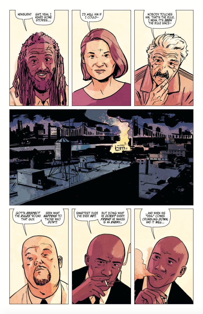
Newburn #1 orders are due in this week and next week the printer starts printing it! This is the part of the process where, if I had human feelings, I’d be excited and nervous to see how many shops want to sell our book. It’s a BIG DEAL launching a new creator-owned title, so I wanted to tell you more about what we’re doing and why you’ll want to order and read it!
NEWBURN IS A CRIME BOOK. It revolves around a successful private detective named Easton Newburn who is on retainer to all the crime families in NYC. He solves crimes within organizations and between them, keeping the city from exploding into gang wars while wandering the city with a massive target on his back!
IT’S SHERLOCK MEETS THE SOPRANOS. I’ve been told this is a VERY effective way to pitch something! It’s a popular thing meets another popular thing! You can’t go wrong! A lot of people tell me that, as a writer, I’m “James Tynion meets desperation!”
FANS OF “CRIMINAL” AND “RECKLESS” WILL LOVE IT. Look, one of us is the son of the guy who draws the Criminal books and their colourist. And the other regularly calls Ed Brubaker “daddy.”
EACH ISSUE IS A DONE-IN-ONE STORY. We’re treating this book like a procedural, so readers can jump in with any issue! I’ve always wanted to write something like this and after working on Daredevil for the past couple of years I finally feel like I can take what I’ve learned from that and write the gritty crime comic I’ve always wanted to read!
WE HAVE SIX OF THESE BAD BOYS IN THE CAN. Did I mention Jacob is amazing and fast?
NEWBURN WILL HAVE BACKUP STORIES. We’re serializing crime stories from up-and-coming comic creators! Our first one is an intense and beautiful story about brothers torn apart by crime! It’s called Brooklyn Zirconia and it’s by Nadia Shammas and Ziyed Yusuf Ayoub!
THE TULA LOTAY VARIANT IS GORGEOUS AND ISN’T ONE OF THOSE “OH I GOTTA ORDER 1000000 TO GET ONE” VARIANTS. You know the ones!
IT’S ALREADY BEEN BOUGHT BY ONE OF THOSE HOLLYWOOD OUTFITS AND I’M WRITING THE PILOT. Look, we know how this goes. Some people will want to check this out because of that. I’m not here to judge. I just want you to read my comic!
IT’S REALLY GOOD. I think?? I mean, I’m the writer so it’s hard for me to judge, but I’m really happy with what we’ve made and Jacob is a superstar talent! One day I’ll learn to love myself!
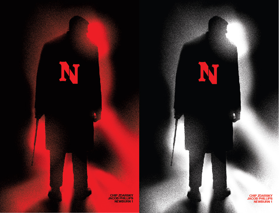
So, yeah! That’s Newburn! And, as mentioned before, we have the CHIP SUBSTACK VARIANT and the CHIPNUTS variant available!
The CHIPNUTS B&W one will be sent out to everyone who subscribed to the Chipnuts level. The red version is available to order from anyone who subscribed annually!
You haven’t don’t that yet?? Subscribe here!
(I just realized Substack has these buttons)
When you’re subscribed, you just have to go here to get them! Signed or unsigned! Time’s TICKING!
oh hey neat
GOD I GET IT EVERYONE SHOULD BUY AND READ NEWBURN
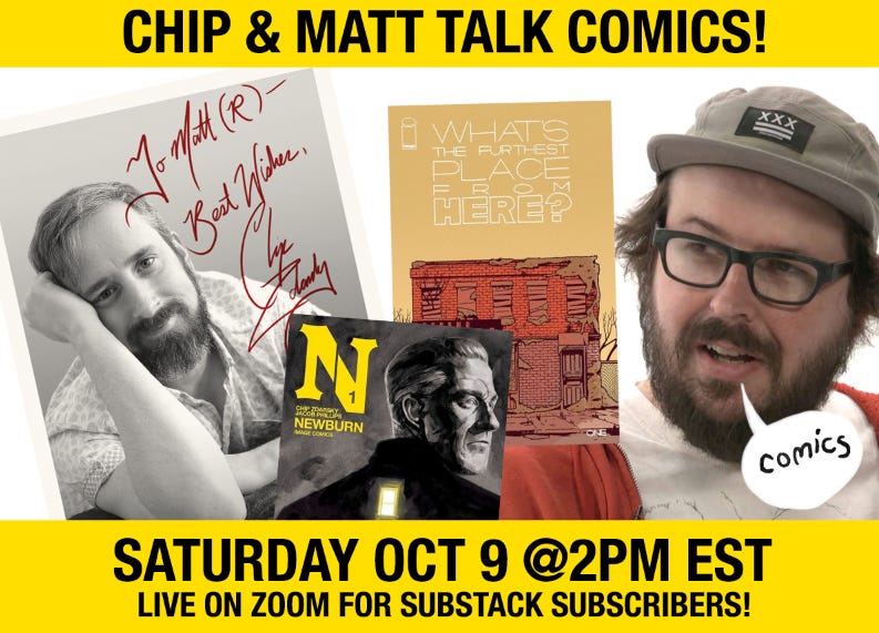
Exactly! And I’ll be talking about that and more this weekend in our FIRST-EVER LIVE ZOOM EVENT!
We’re going to do an informal and fun chat with Matt Rosenberg, fancy-pants writer of the new Image book WHAT’S THE FURTHEST PLACE FROM HERE! I’m going to treat it like a comic con panel and we’ll chat with YOU, the READER, as you get to ask questions of both of us! It’s this SATURDAY and, if you’re a subscriber, you’ll get a password emailed to you just before the event begins to grant you access!
How do I subscribe, you ask? It’s easy!
uh oh i’m addicted to buttons
DON’T PEOPLE HAVE BETTER THINGS TO DO ON A SATURDAY
Look, I respect the workweek and our capitalist society too much to interfere with that
WELL GOOD LUCK WITH THAT
Thanks!
Well, I think that’s it? I don’t have new books out this week and I’m so horribly out of the loop on what society is talking about now that I’m off twitter, I have nothing to comment on, really. Last week, while we were in bed, my wife made a joke about Nicki Minaj’s cousin’s balls and I swear I actually got angry once I realized it was some twitter thing.
I guess I could do a quick process bit about my colouring? I can’t believe I’ve done a whole two months of these without doing “process posts.” Well, here you go!
WARNING: THIS IS BASICALLY FOR ARTISTS ONLY, I’M SORRY.
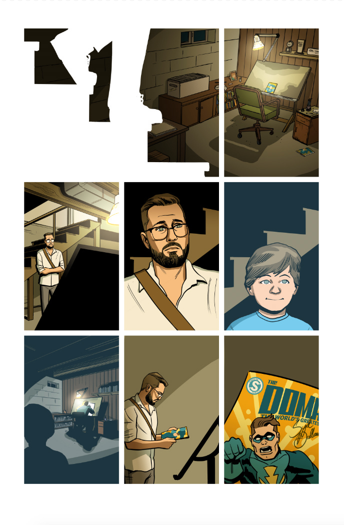
This was a recent page of PUBLIC DOMAIN. I draw the pages in ClipStudio, which is designed for comics and is amaaaazing. I started using it on Sex Criminals and haven’t looked back.
So you can see in the the top tier that I left the linework open and airy in the studio with no black shadows to speak of. There are a couple of reasons for that. One, I wanted it to feel different from the usual panels, as it’s a new location and place of quiet reverence. Second, I wanted to use colour for the shadows here with the lamp being the only light source.
After I draw them I pass my pages along to my amazing colour flatter, Becka, who blocks in colours so it’s easier for me to just select the areas, change the colours, and render.
After that, I do a pass of colouring that’s fairly literal. By that I mean I colour objects and settings without taking into account colour shifts from the type of light. At this stage I get a feel for what the palette of the scene is. I like the orange/brown contrast with the blue, so I keep that going with the next step.
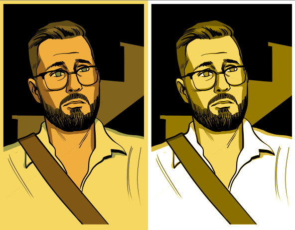
The image on the right is that next step, where I put two additional layers over the present day scenes. The main one is “multiply,” where I fill it with a light yellow colour and it adds to the layer below it, giving that nice warm feeling. The “colour” layer adds to that, where it changes the colour of the layers below it. I have them at low opacity so they’re not too intense.
Here, I’ll show you the difference between them at full opacity:
The left is MULTIPLY, which is like putting a yellow film over existing colours. The right is COLOUR, which changes the colour of what’s beneath it into yellow tones.
Anyway, those in conjunction really help unify the colour in a piece!
For the final page I do three more things:
For the panels set in the past I add a blue “screen” filter to cement it being a different time/scene. “Screen” is hard to explain. Basically it retains the vivid white/light of the layer below it and changes the colour of the darker colours and lightens them. It’s funny, I use these all the time but can’t really explain them?
I use “multiply” again in panel one, but instead of filling the whole panel, I use a gradient from left to right of a grey-ish brown, which, on top of the current panel, adds a since deep transition. I use it again in a couple of other present day panels for mood.
I used “linear dodge” and gradients to add the light bursts and then I’m done!
Usually when I finish a page I use “colour balance” and “levels” to make adjustments so the palette/values are stronger, but this one turned out okay without that. The warm/cool works well and it has the mood I’m looking for.
When I’m colouring, or drawing, I usually have rules for myself. Characters and objects are all two-tone, with exceptions being characters with shiny skin, in which case I’ll add a third tone. The big difference between my rules on Sex Criminals and my rules on Public Domain is this:
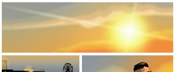
Here’s a Sex Criminals sunset:
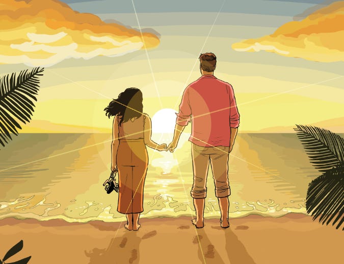
And here’s a Public Domain sunset:
You spot the difference? In Sex Criminals I never ever used gradients or blur unless the characters were in “The Quiet.” It kept things sharp and crisp, but man oh man it made colouring things like sunsets hell. Look at it! I’d have to colour in flat block bands of colour even though naturally they’d be smooth, soft gradients.
So for Public Domain I withdrew that restriction. It’s good to have restrictions or your work can end up a weird shiny, over-rendered mess! But I really wanted to do different effects with the new project, so there you have it.
…HUH? SORRY, I TUNED OUT AT “TAKING INTO ACCOUNT COLOUR SHIFTS”
I promise I won’t do another of these process posts for a long time I’m so sorry
Oh, hey! If you liked the look of that Public Domain page, there’s a button for that
And, hey! Don’t forget to
Bye!
-Chip




I really deeply respect your willingness to ruin the sleep schedule of all Australians, strong effort
Oh wow, thank you for sharing your coloring process! (Now reading about what a color flatter does.)
If you have the time to talk about it, I’d also love to hear about your philosophy with coloring. Like, how do you think about the color choices? How do you make decisions like gradient vs color blocks? And what do you see in another artist’s coloring––say, when you look at your collaborator Jacob Phillip’s coloring work for his dad & Brubaker’s series (I assume you’re a fan!)?
So excited for Newburn!!!!
For your future process posts, I'd *love* to learn about your writing method and how you keep all the various projects going at once. Thank you!